Sometimes we forget how the little things in life are so very powerful. Sometimes this is true of your SaaS ERP provider, like NetSuite… they provide the goodies, we just forget to use them.
A few days ago I was working on a project, how best to present to our customers usage statistics of our AppWrap MineSweep solution.
MineSweep enables you and your team to disarm data and process exceptions (or “mines”) before they “blow up”. The solution encapsulated NetSuite’s powerful saved searches with enhanced probe functions to identify, collaborate, fix and document these potential data and process exceptions or high-risk records. We ship the solution with more than 100 pre-built probes and you can easily add more custom probes based on your saved searches. MineSweep is Built for NetSuite (BFN) certified.
Probe examples:
- Data errors and integrity: Transaction against wrong Departments or Locations
- Potential fraud: Vendor and Employee Bank Account is the same
- Noise due to stale data: Old or unused Vendors
- Implement appropriate internal controls and audit preparedness: JE preparer same as approver
MineSweep uses several custom records and a few scheduled SuiteScripts to generate and present data to the end users. As we can’t add custom report types I had to find the most efficient way to add these reports/charts and distribute them to our customers.
NetSuite Analytics would have been one route. Analytics is a great emerging NetSuite technology for reports, pivot tables and charts. Analytics has some challenges, some interactivity limits and distribution difficulties.
NetSuite Save Searches would be a natural medium to organize data (and is easy to distribute). That said, looking at a Save Search result is a bit “bland”. How to jazz it up? Make it interactive and intuitive?
Step in NetSuite Trend Graph Portlet – the little chart that could.
“The dashboard trend graphs can be used to illustrate the differences in data over time for up to three KPIs.” As you can discern from NetSuite’s description, all metrics presented in a Trend Graph can be presented as KPIs (in KPI portlet, scorecard and meters). More about those in a future post as I want to focus on the graphical/interactive presentation of our usage data.
Trend graphs offer choices to display your data in
- Area, Line, Bar, or Column charts
- Continuous or side-by-side comparisons (with or without moving averages)
- Use the thumbnails to control display and the dropdown to set the time period for the trend graph data (Daily, Weekly, Monthly, Quarterly or Yearly). Note that comparison is only available when the period is set to Monthly or Quarterly
- You can toggle data series on/off by clicking on them in the legend and
- As you scroll over a data point the value/details are presented.
But wait, there is more… - You can export the data points to CSV and download the chart image to PNG, JPG, PDF, and SVG files
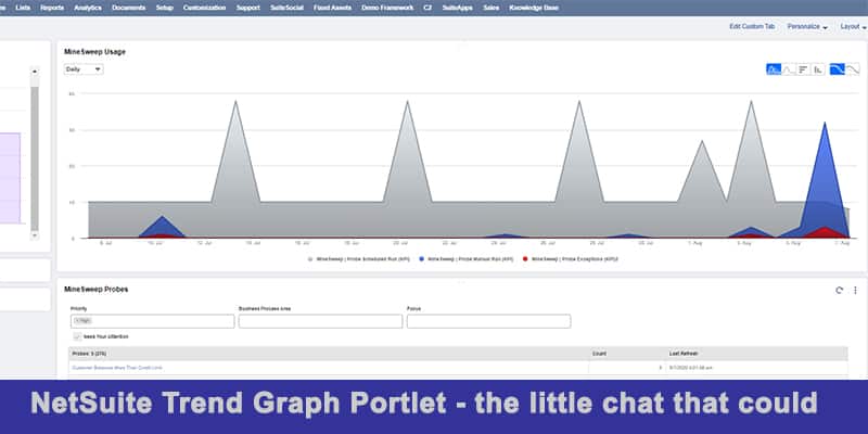
In the above trend graph we are looking at daily MineSweep usage:
MineSweep’s scheduled probe runs in gray – MineSweep’s heartbeat if you will (and I’ve toggled off its moving average). The unique shape of this data series is tied to the fact that we have probes executing daily, weekly and monthly.
MineSweep manual probe executions in blue (with moving average enabled) – this is when a user either drills into the probes details from the main MineSweep dashboard or directly executes the probe to look at the exceptions surfaced by the probe
MineSweep exceptions in red. The count record the user “cleared” and commented on within the solution.
In this trend graph we can clearly see that there is a healthy distribution of probes running on different schedules and the customer is actively investigating probes and excluding (clearing) records. MineSweep is being used!
So, how can you take advantage of these Trend Graphs?
Simply create your saved search with these three rules in mind:
- Not include any date fields defined as filters on the Criteria subtab.
- Have exactly one field with a summary type (such as count, group, or sum) defined on the Results subtab
- Have a date field defined as an available filter on the Available Filters subtab.
Yes, that’s all it takes.
Will you take advantage of NetSuite Trend Graphs?
Minesweep is a Governance, Risk, and Compliance (GRC) solution within Netsuite Product suite that supports organization in business process alignment.
NetSuite is complicated – We make it simple
Leverage our knowledge base and decades of experience to maximize NetSuite’s functionality for your business. We know what NetSuite does well and what it doesn’t. Schedule your 1-hour optimization call with our expert NetSuite team today, our gift to you.
